Sea++ is developing an interactive web application to help communicate the process of conducting management strategy evaluations (MSE) in a succinct and visual form.
The idea is to focus on several key aspects, including: accounting for uncertainty, model reliability, and the overall message of the simulation results.
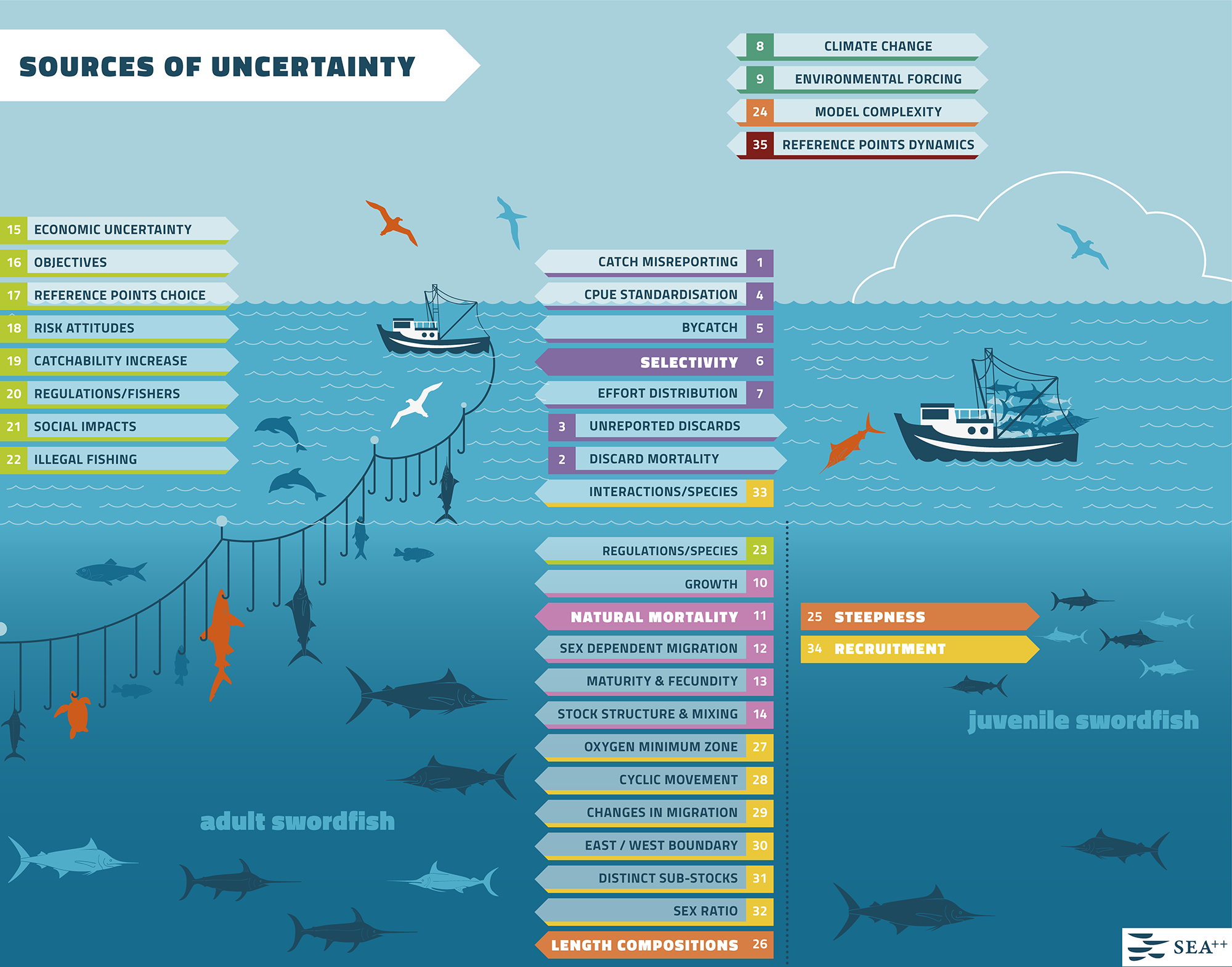
Accounting for uncertainty
The first image represents the context of uncertainty out of which various scenarios for testing management procedures are usually constructed. To illustrate the many kinds of unknown/uncertain features of the system which the models aim to represent we used an infographic approach. The main image uses a physical space to represent a conceptual space with recognisible elements: fishing vessels, adult fish, juvenile fish, environment, non-target species and incidental catch such as birds and turtles, and discards. This is the space where uncertainties that were identified through literature review, working groups, and expert elicitation are allocated in the shape of signposted arrows generally pointing in the direction of an object representing the main source of uncertainty. For example, ‘discards’ is pointed at a fishing vessel, while ‘growth’ at the fish.
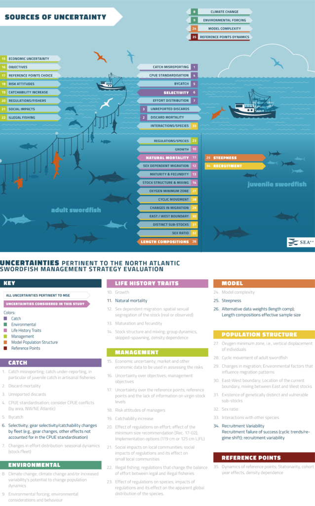
The key below the figure classifies these sources of uncertainty which are also colour coded.
This image and the key are meant not just to illustrate graphically many different kind of uncertainties that are relevant in performing MSE, but to highlight the difficulty of accounting for all of these sources.
In the current version of the MSE trials for swordfish only 5 sources were modelled. These are highlighted by the solid colours in the image and by the bolder text in the key.
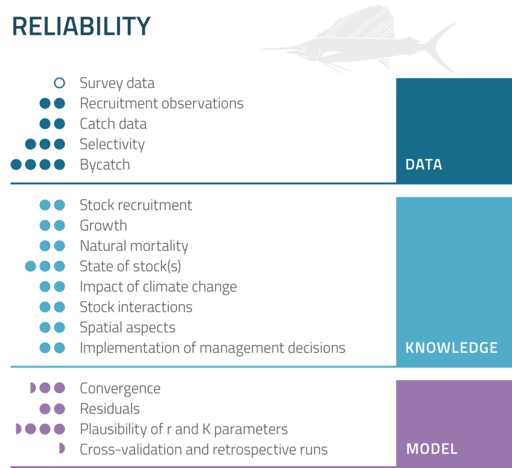
Model reliability
When decision makers are given scientific advice based on modelling, it is important to also be able communicate how reliable these results are so that the decision makers can factor in scientific uncertainty. Not all models are equally reliable, and it would be advantageous to decision makers and scientists to be able to compare models at a glance. This app follows developments in JAKFISH and MYFISH EU research projects that aimed to create a visual key that qualitatively addresses main concerns such as model inputs in terms of data and knowledge. Additionally, we have now included a qualitative key for representing results of model validation.
Model results
Modelling produces a mass variety of statistical information, and MSE are generally accompanied with technical reports that contain a lot of detail. In the app we wanted to summarise simulation results, so that in one image we could represent how a selection of management procedures perform on several criteria under different scenarios.
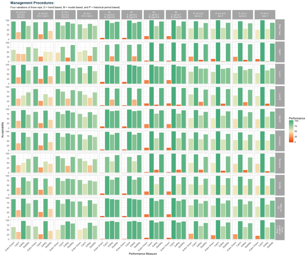
We normalised the results so that the best outcome on each of the criteria would be represted by a full green bar. This way it is relativily intuitive to look down a column representing a management procedure to see which scenarios causes it to underperform, and on which criteria. Similarly, it is possible to tell at a glance which scenarios cause a range of management procedures to underperform – these are the rows with low height of the bars, highlighted also in shades veering towards orange as performance deteriorates (low bars).